
.png)
WHAT: responsive website design + branding for fashion retailer
WHEN: march - june 2020 (approx. 260hrs)
WHO: project lead, UX/UI designer, researcher

I believe in two core things:
+ Products should be designed so that everyone has the opportunity to explore, learn, and accomplish tasks with ease (and a good dose a fun doesn’t hurt either).
This is at the heart of what I do. Listening and responding to user feedback through rigorous testing, iteration, and thoughtful design ensures this goal. Users, by definition, are who we are designing for (not ourselves) and all too often they take a backseat. This passion drove me to devote myself to the craft of UX/UI design and to dreaming up creative, simple solutions that inspire, spark joy, and empower.
+ Equality should be at the forefront of every aspect of life.
I stand for and with all people regardless of race, sex, class, orientation, identification, ability, etc. I was taught growing up to love, stand up for what is right and just, and to treat others like my neighbors. It has been my mission to live these values, not only in my personal life, but in my professional work. You and I inhabit the same Earth. We should have the same access and rights. We are all humans attempting to make and find our way through life. These values should be at the forefront of how we design products, services, and the world around us.
see myEighty-six° was a solely brick-and-mortar fashion retailer looking to capitalize on the surging wave of e-commerce in the clothing sector, an area they were quickly losing ground in. Focused on changing its core demographic to that of a younger audience, and with a renewed sense of environmental responsibility and affordability, the brand was looking to evolve its image and introduce its online presence. I was tasked with crafting their new chapter by building a responsive website and a new identity.
This involved ensuring a new, clear, and bold message was presented in order to entice younger customers who view online shopping as the primary way to consume. They wanted something fresh and innovative to make their debut stand apart from their numerous, long-standing competitors.
Over the course of four months and many iterations, with users always at the forefront of the process, the new Eighty-six° was born.
I chose to work under the Design Thinking process in order to get to the core of what the user wanted and needed.

As always, I feel it is important to involve real users throughout the entire design journey. This enables the creation of a site that works for them, with new and existing features and elements that are understandable, memorable, and fresh. By empathizing with the user and seeing everything from their perspective, you are able to define the exact problem they are encountering, ideate around ways to solve it, design and prototype that fix, and test the solution with those users - all before repeating the process over again. This cyclical endeavor keeps the users front of mind, with their quotes, stories, and experiences permeating through every aspect of your process.


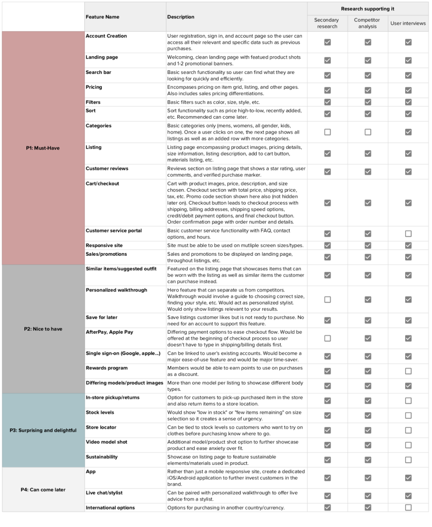
Using the user research gathered during the empathize stage, I proceeded to develop priorities and set goals for the first design of the MVP with the users/customers always at the core.
This included creating a feature roadmap, conducting a card sorting exercise to determine the best way to categorize clothing options, drafting up a sitemap, and generating user and task flows.
A feature roadmap was created to prioritize MVP features and to align our goals with user needs, as supported by research.
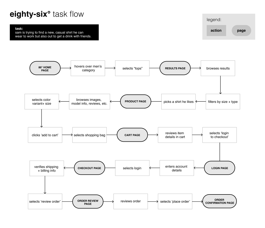
I then began to put myself in the shoes of my persona and develop user and task flows based on what I perceived Sam would be searching for on our site and the research conducted. This helped to determine what pages were most essential in our design as well as where the blockers existed/what areas of the typical flow could be improved.
At the forefront of my mind were questions such as:
+ how can we shorten steps?
+ how can we reduce the number of pages and interactions needed to make a purchase?


A product is only as good as the user’s ability to actually use it (and find joy in doing so). The critical testing phase of the design process allowed me to show my designs to potential users and receive valuable feedback from which further iterations could be derived.
Goals of this test included:
+ Ensuring that all navigational elements were clear and essential shopping tasks were easy to perform
+ To allow for general feedback on the overall visual design of the product
+ To collect actionable data on what needed to be improved further on the site and what else could be done to ease user frustrations while providing a site that is still fresh, bold, and exemplifies the brand values
Tests were conducted using a Figma prototype of high-fidelity mockups. Users were asked to share their screen via Zoom (conducted remotely due to COVID-19) and proceed through several steps in the task flow (including the purchase of a gray bomber jacket).
The test resulted in:
+ 100% of users being able to complete all tasks in a timely manner with no leading/guidance
+ 5% error rate as some users struggled to understand some of the less common patterns, as expected. These users were able to correct on their own in a matter of seconds.
+ Overall, most of the users said the same things: the website looked trendy, clean, and they would want to shop here. However, it did reveal a few areas that needed to be worked on:
An affinity map, seen below, showcases these findings using actual quotes from the interviews conducted.

The test highlighted areas of work and priority was placed on those with the greatest impact to users:
+ Bringing sale to the forefront in menus to drive revenue
+ Iterating on the breadcrumb to make navigation easier and less cluttered
+ Adjusting the carousel on the product page to allow all photos to be visible at once
+ Creating a new look for sale banners
+ Improving the learnability and visual indicators for navigating on the homepage special collections
You can see some of these improvements in the final responsive designs in the prototype.
Overall, working on Eighty-six° was a true joy. Being able to draft a new shopping experience that felt familiar yet bold was exciting. As more and more online experiences begin to feel the same, this site allowed me to explore slightly more innovative options for improving the user experience in the e-commerce realm.
The biggest challenge, as designers often face, was to continue to push toward something that was new without falling into the trap of losing the crucial aspect of memorability, which would lead to user’s not knowing how to properly navigate or make a purchase with ease and satisfaction. I learned that sometimes it is more appropriate to fall back on a design pattern than to try and reinvent the wheel too much. In doing so, you find smaller ways to improve upon certain elements and captivate the user.
In reflecting upon this design, there are certainly many aspects where work could still be done to improve the overall flow in order to further streamline and expedite tasks. However, as demonstrated in my usability testing, I do believe many strides were made in creating a brand and site that presented itself as a new form of accessible high end. One in which customers can feel as if they are shopping in a more exclusive, expensive store...with H+M prices.
Users, especially now in this modern influx of similar experiences, are craving something more personal. They want to shop online but they want it to feel as if they are still in the store. I believe it is our responsibility as UX designers to continue creating spaces in the browser or on the phone that extend beyond the screen and richly engage customers to keep them coming back for more. Hopefully, with this project, I was able to do that, even if just a little bit.
.png)